About me
NCR design system

NCR Banking
Design System
My Role
Company
Status
When
Design lead
NCR
Shipped
2021
Project Overview
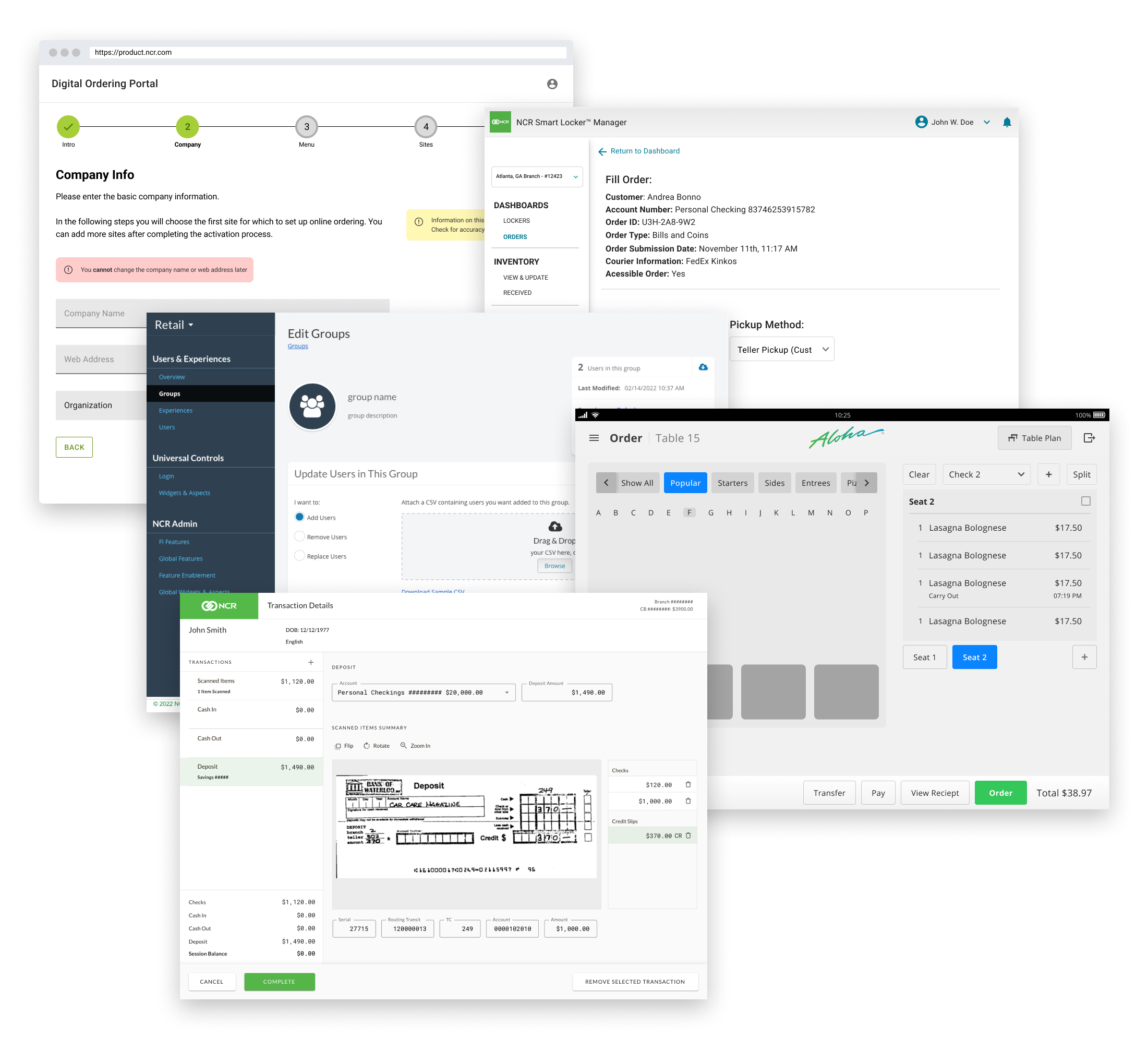
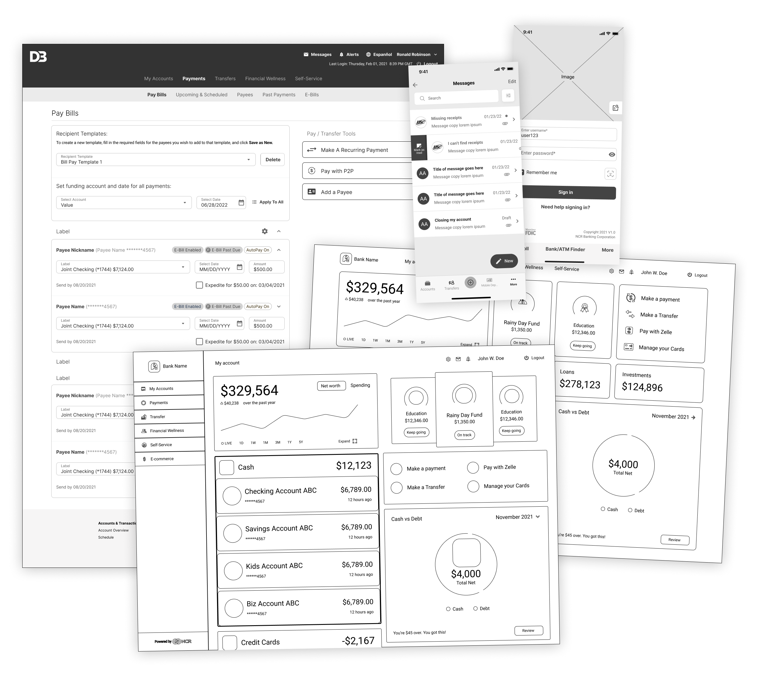
NCR has created a new, unified design system which spans across all lines of business (Banking, Retail, Hospitality).
To technically align and yet visually separate these lines of business we have created the “Banking Theme”. This theme shares the same base components with the Core Design System but expands and extends it through banking specific components, assemblies and patterns.
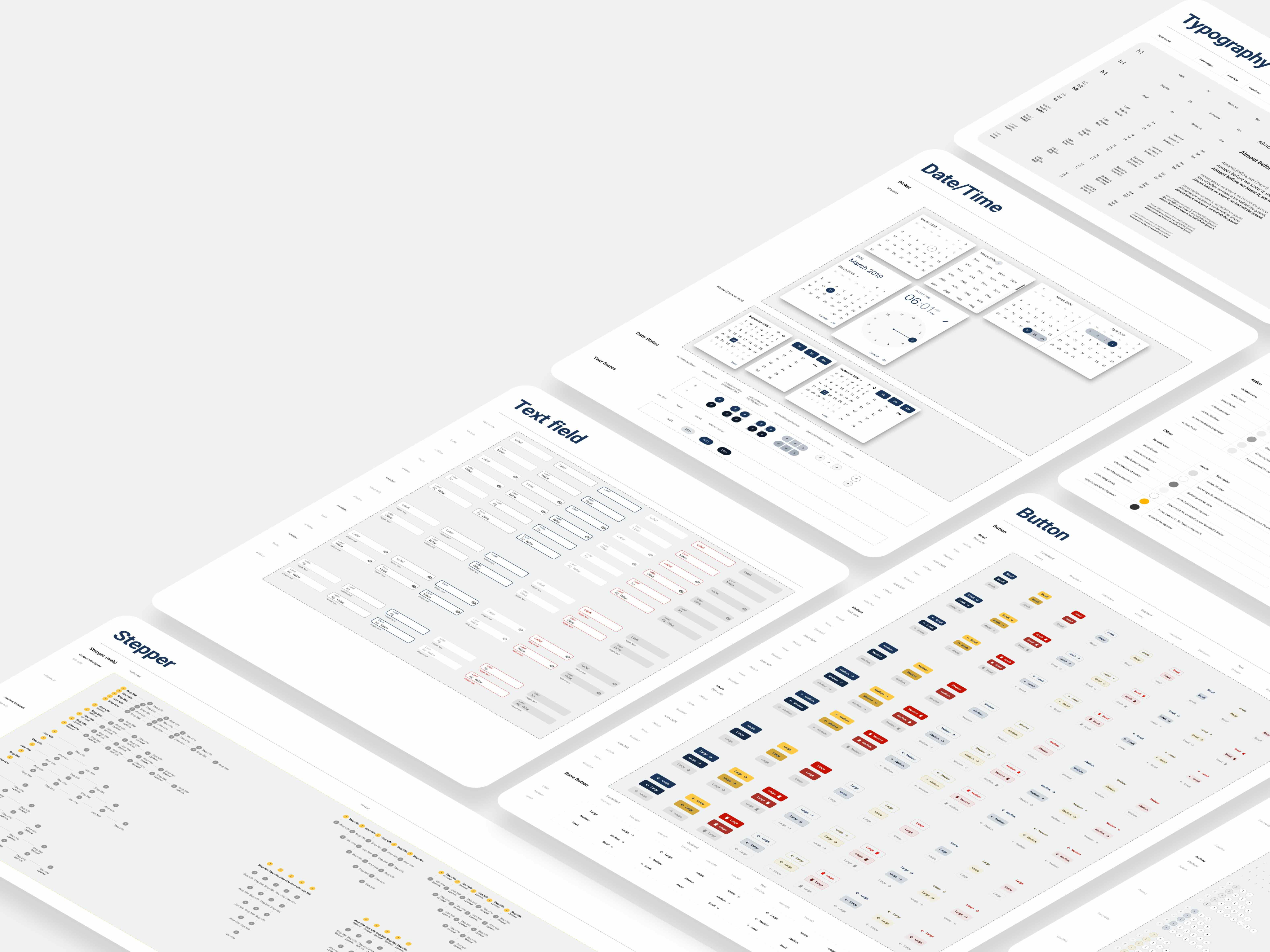
The entire design system was built in Figma.
From many to one
Over the years NCR had the “NCR Design System (NUI)” which was the foundation of all in-house designed products. Though it was not centrally managed and enforced and as the company acquired other companies and products the portfolio became increasingly and visually disconnected.
MUI
The strategic decision was made to leverage MUI going forward, but we did not want to be “just another MUI shop”. Our core components are based on MUI with slight modifications and theming applied to them. Furthermore we have established our own patterns and rules around this.
Testing
We have looked at current products and those scheduled for an uplift and made sure that the components we were getting were working for all products.
That has resulted in minimizing some component variants, changing others and building new ones where needed.
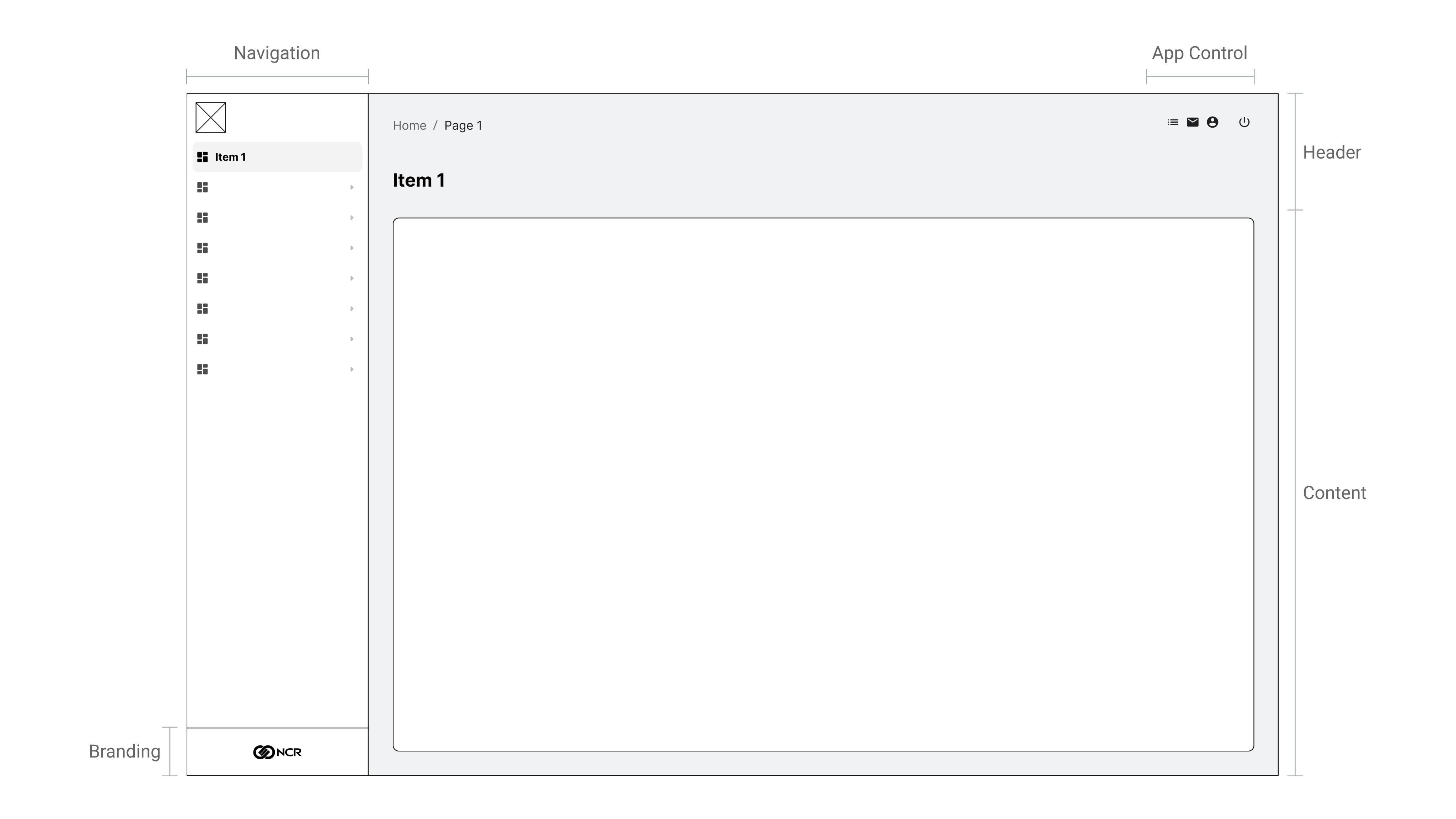
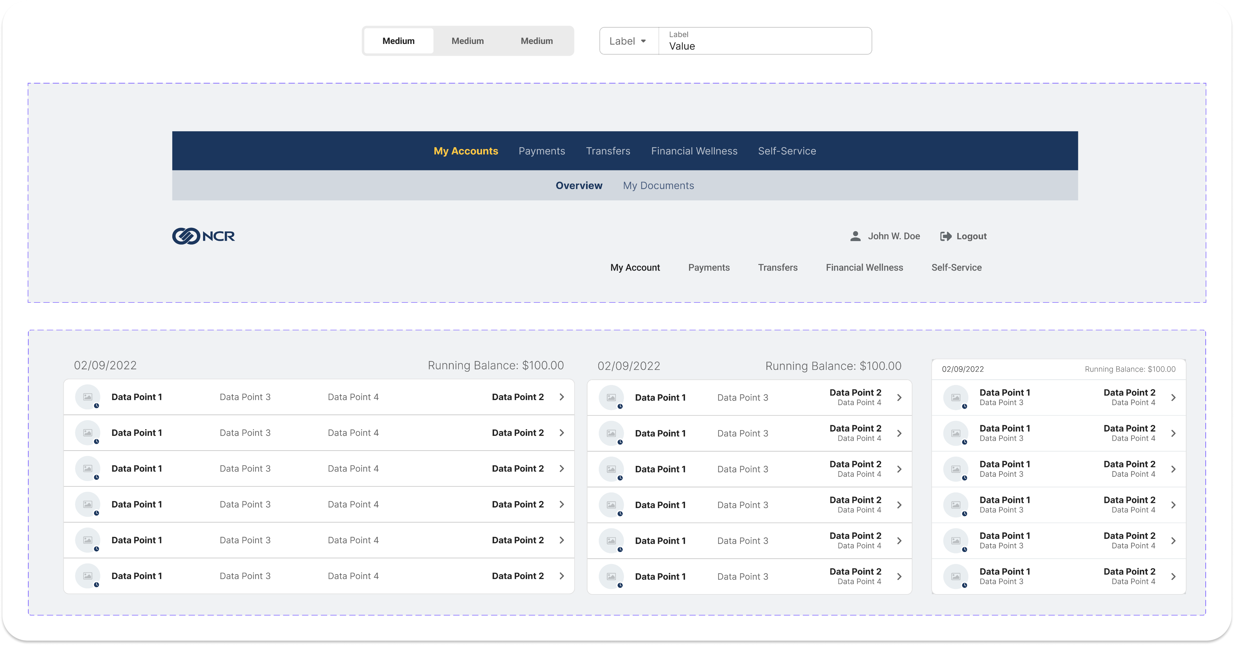
App Shell
Going forward, all admin products are going to use a common app shell with minor differences in type of navigation (accordion vs. progressive) and app control features.
What is going to remain common though is the H1, 4px grid and behavioral patterns.
Accessibility
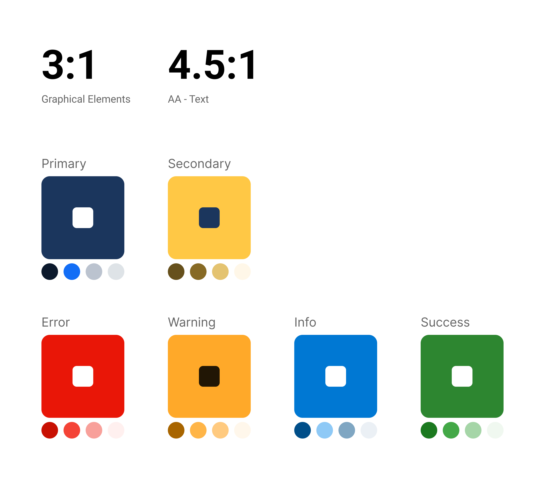
Color
This color scheme is used to “brand” our banking products and showcase them to clients.
Accessibility is very important to NCR and so we made sure that all of our colors and color contrast meet accessibility standards.
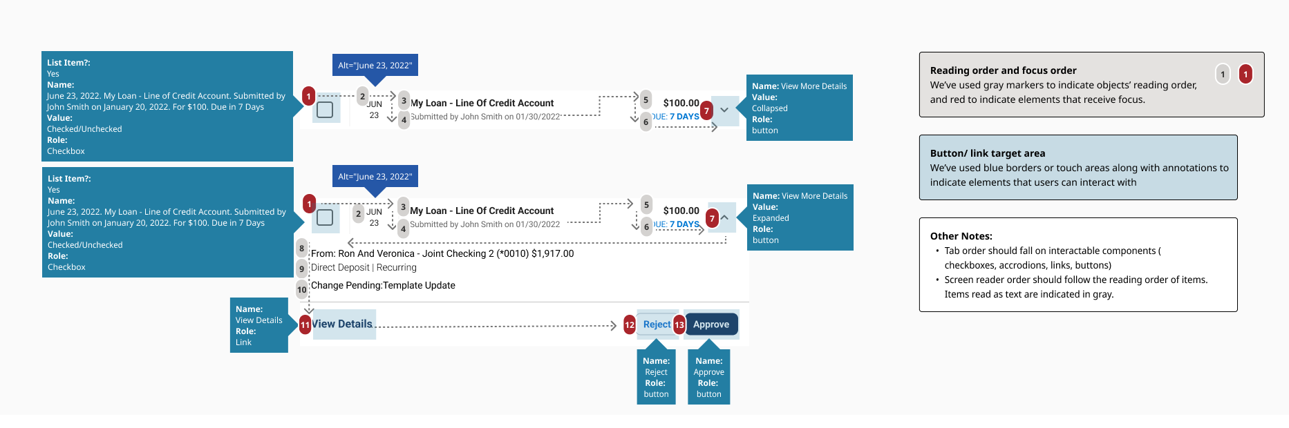
Review
Our accessibility team has inspected every component and worked with us and our developers to ensure correct tab order as well as screen-reader behavior.
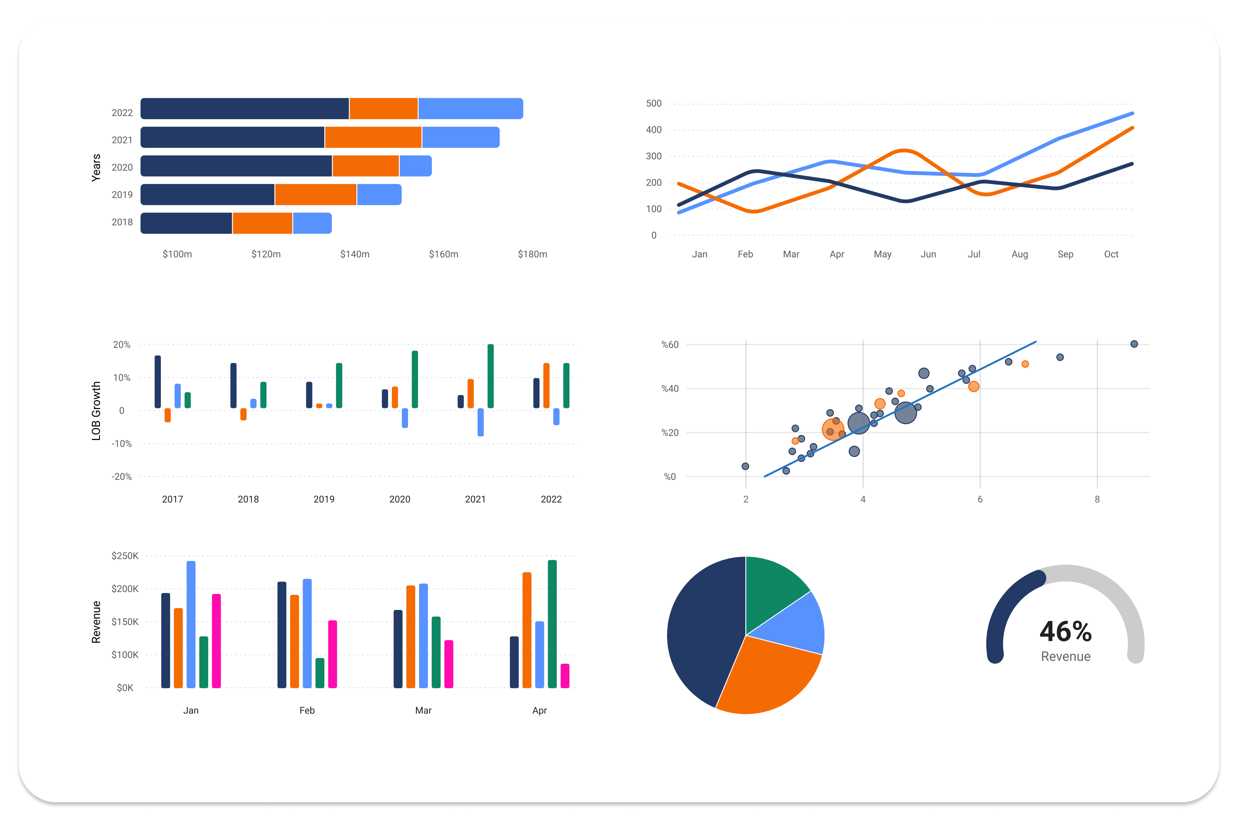
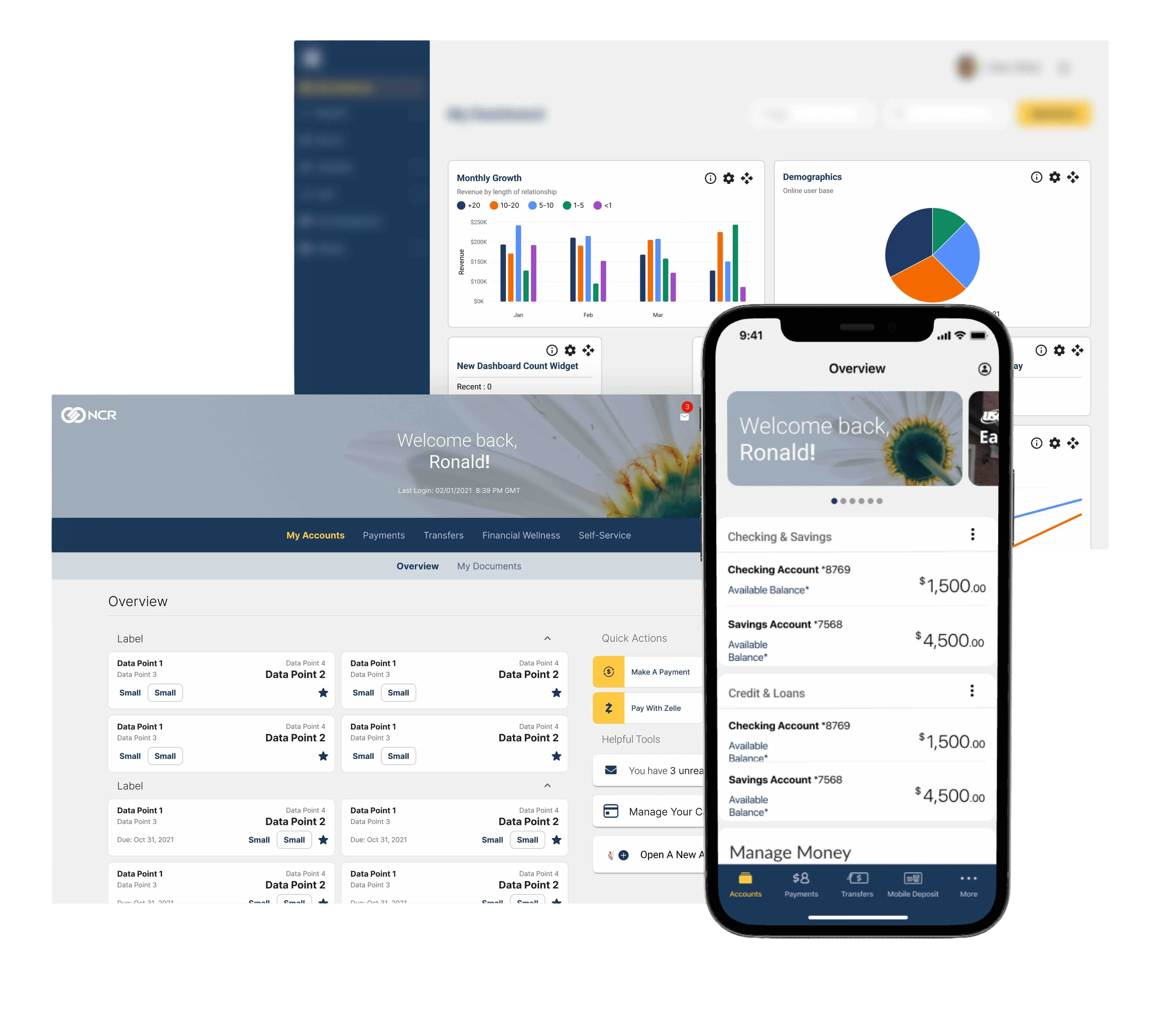
Data Visualization
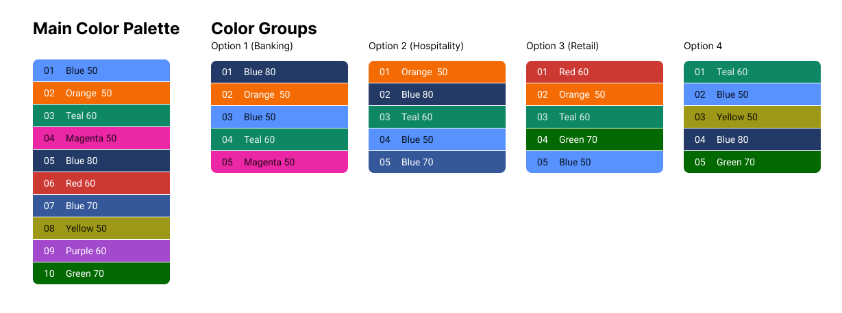
I created a data visualization library with various types of charts, each with different states and where possible with auto layouts for easier use by fellow team mates.
In addition I helped create a comprehensive color palette from which multiple color groups were derived to ensure accessibility and fit for all lines of business.
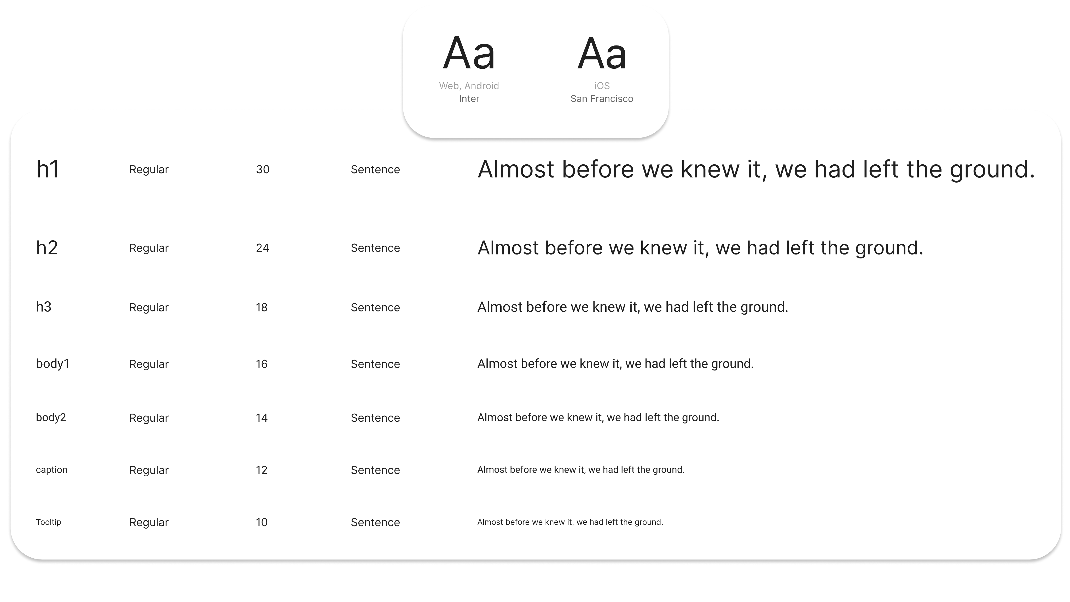
Typography
We have looked at multiple font and for web and Android Inter is our font of choice.
Inter provides a modern aesthetic that works well on web and mobile.
For iOS we stay native and will be using San Francisco.
All font sizes come in 3 different weights.

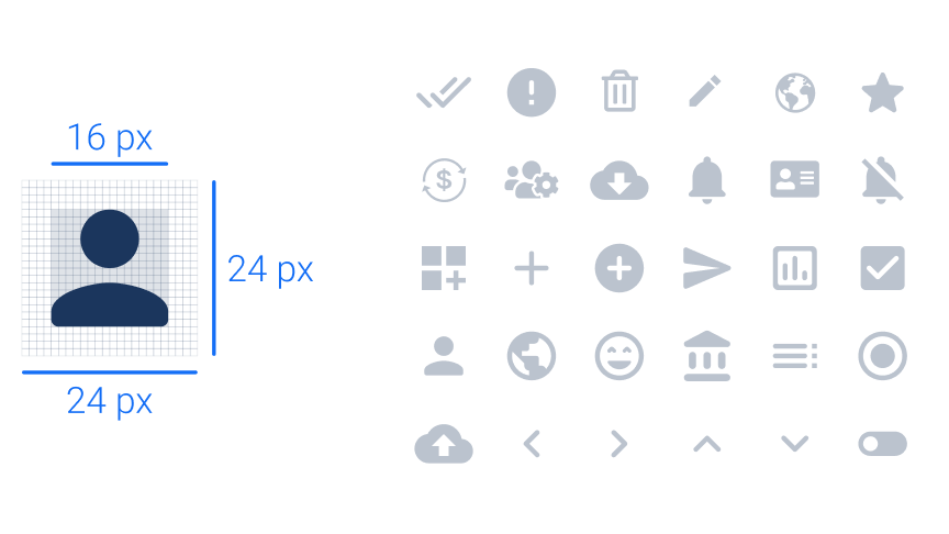
Iconography
Our products are currently using Material UI icons until we have our own, proprietary icon library which is geared towards the industries we serve.
Every icon frame is 24px x 24px with the icon itself being 16px x 16px.
Icons can scale as long as they align to the 4px grid.
LOB Specific Components
Beyond the core components provided by MUI we have LOB specific components and assemblies like filtered inputs, horizontal navigation and a variety of list items.
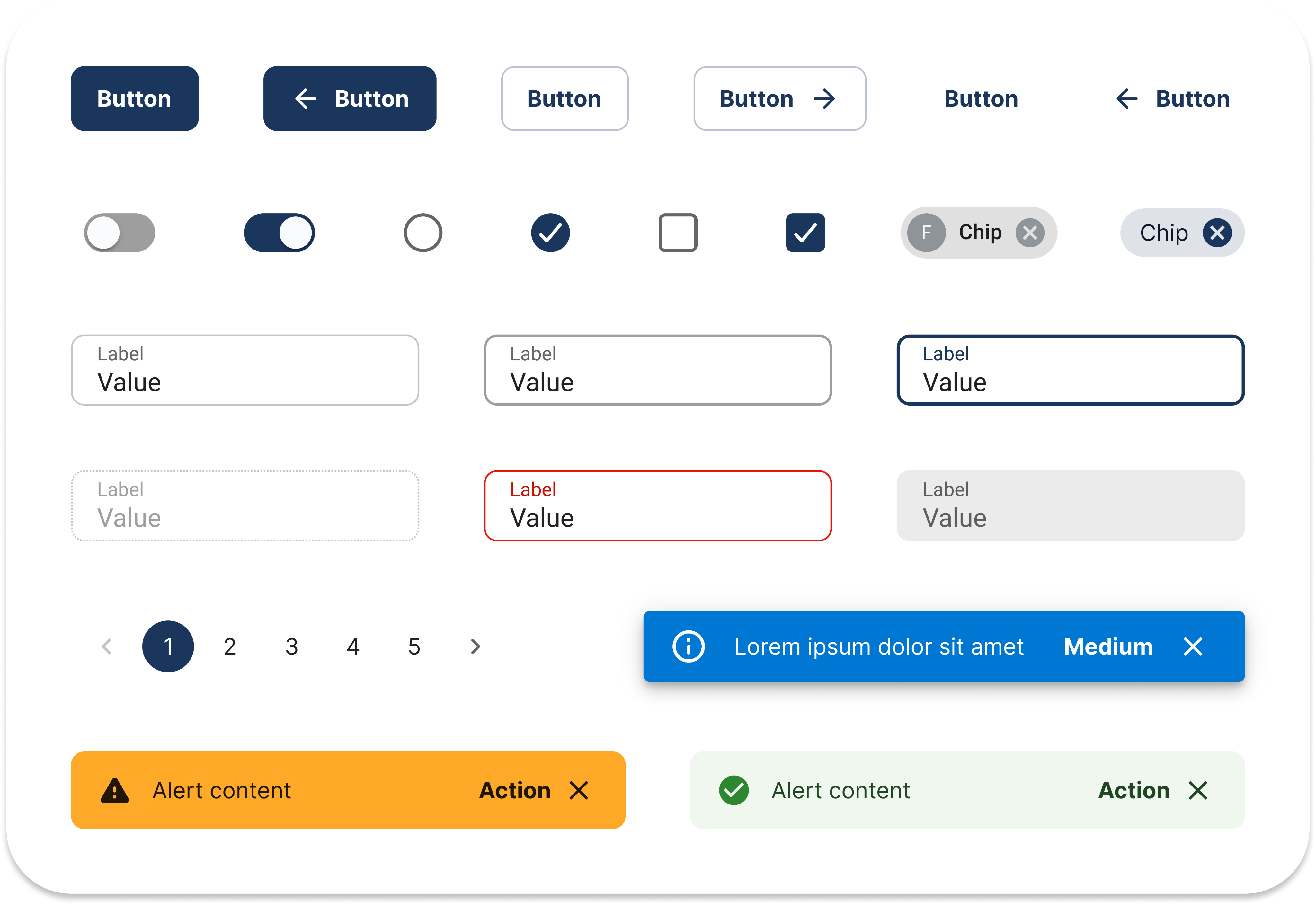
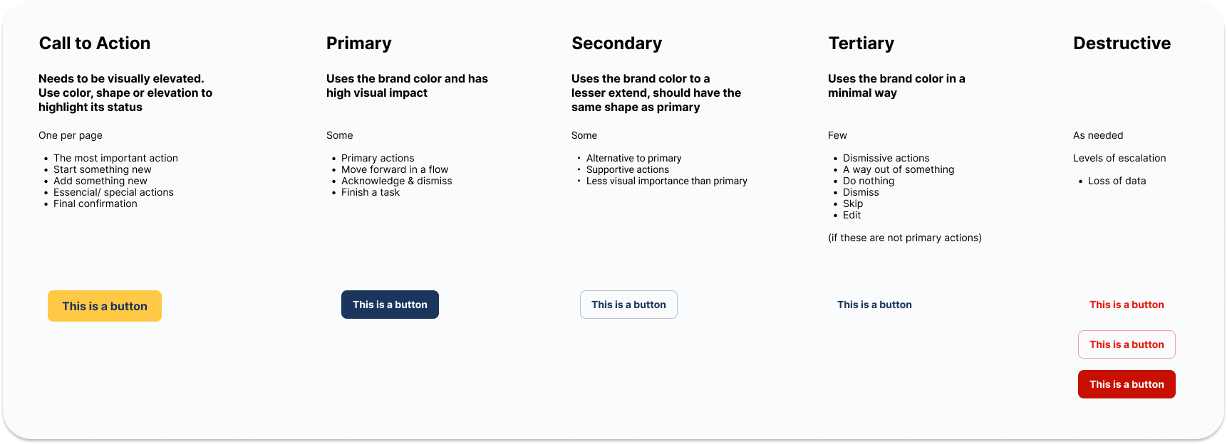
Button Usage
We recommend to limit the the use of CTA buttons to one per page. Primary and secondary buttons will make up most of the controls and not every screen is required to have a CTA.
Clients can choose how to differentiate CTA buttons from all others through shape, color, size and shadows. Our banking base theme is using color as a differentiator.
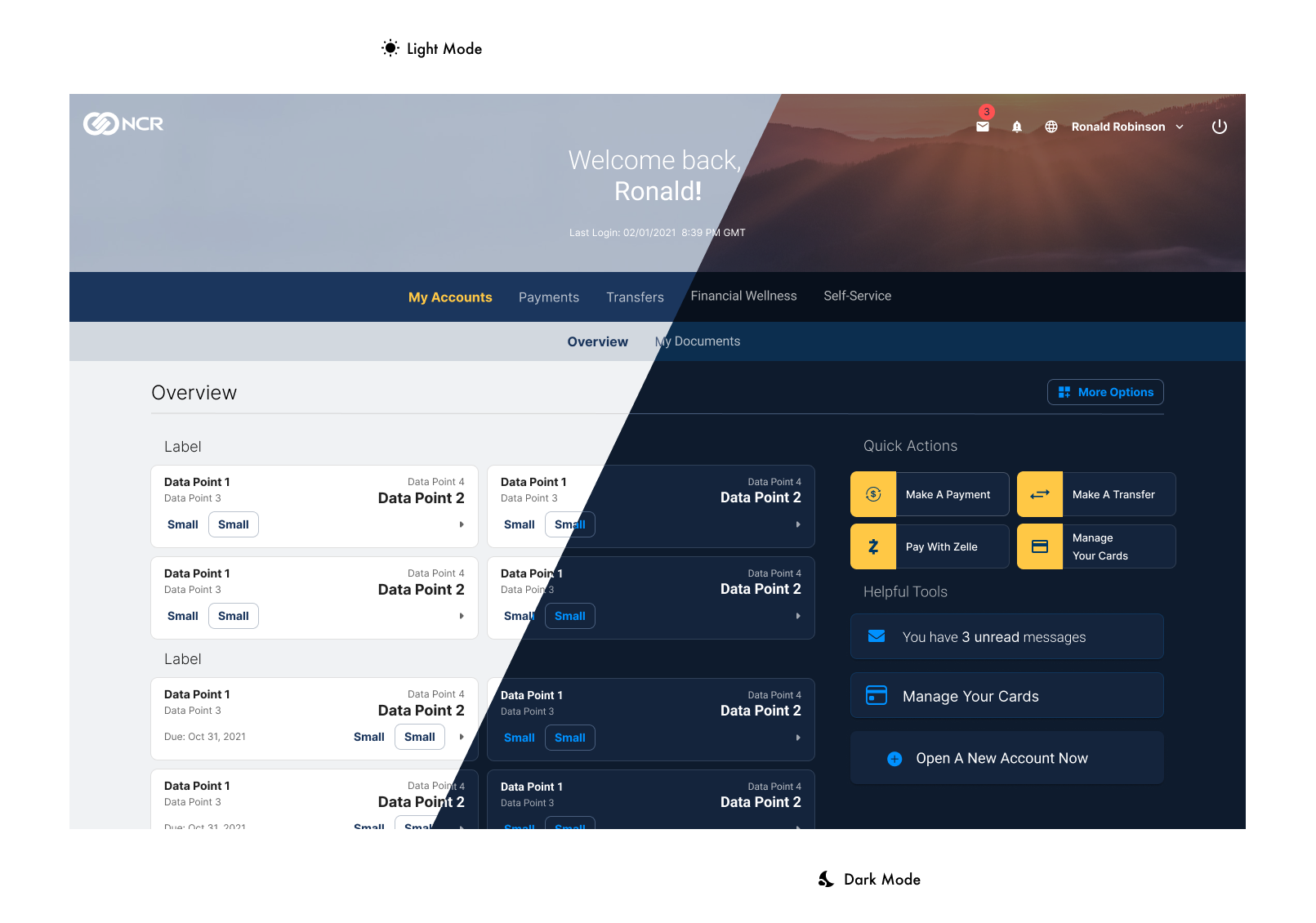
Modes
We provide a light and dark mode version of our design system to our clients which they can brand and theme using the admin platform.


Tim Gerlach
+1 (843) 617 0288

About me
NCR design system
NCR Banking
Design System
My Role
Company
Status
When
Design lead
NCR
Shipped
2021
Project Overview
NCR has created a new, unified design system which spans across all lines of business (Banking, Retail, Hospitality).
To technically align and yet visually separate these lines of business we have created the “Banking Theme”. This theme shares the same base components with the Core Design System but expands and extends it through banking specific components, assemblies and patterns.
The entire design system was built in Figma.
From many to one
Over the years NCR had the “NCR Design System (NUI)” which was the foundation of all in-house designed products. Though it was not centrally managed and enforced and as the company acquired other companies and products the portfolio became increasingly and visually disconnected.
MUI
The strategic decision was made to leverage MUI going forward, but we did not want to be “just another MUI shop”. Our core components are based on MUI with slight modifications and theming applied to them. Furthermore we have established our own patterns and rules around this.
Testing
We have looked at current products and those scheduled for an uplift and made sure that the components we were getting were working for all products.
That has resulted in minimizing some component variants, changing others and building new ones where needed.
App Shell
Going forward, all admin products are going to use a common app shell with minor differences in type of navigation (accordion vs. progressive) and app control features.
What is going to remain common though is the H1, 4px grid and behavioral patterns.
Accessibility
Color
This color scheme is used to “brand” our banking products and showcase them to clients.
Accessibility is very important to NCR and so we made sure that all of our colors and color contrast meet accessibility standards.
Review
Our accessibility team has inspected every component and worked with us and our developers to ensure correct tab order as well as screen-reader behavior.
Data Visualization
I created a data visualization library with various types of charts, each with different states and where possible with auto layouts for easier use by fellow team mates.
In addition I helped create a comprehensive color palette from which multiple color groups were derived to ensure accessibility and fit for all lines of business.
Typography
We have looked at multiple font and for web and Android Inter is our font of choice.
Inter provides a modern aesthetic that works well on web and mobile.
For iOS we stay native and will be using San Francisco.
All font sizes come in 3 different weights.
Iconography
Our products are currently using Material UI icons until we have our own, proprietary icon library which is geared towards the industries we serve.
Every icon frame is 24px x 24px with the icon itself being 16px x 16px.
Icons can scale as long as they align to the 4px grid.
LOB Specific Components
Beyond the core components provided by MUI we have LOB specific components and assemblies like filtered inputs, horizontal navigation and a variety of list items.
Button Usage
We recommend to limit the the use of CTA buttons to one per page. Primary and secondary buttons will make up most of the controls and not every screen is required to have a CTA.
Clients can choose how to differentiate CTA buttons from all others through shape, color, size and shadows. Our banking base theme is using color as a differentiator.
Modes
We provide a light and dark mode version of our design system to our clients which they can brand and theme using the admin platform.
Tim Gerlach
+1 (843) 617 0288